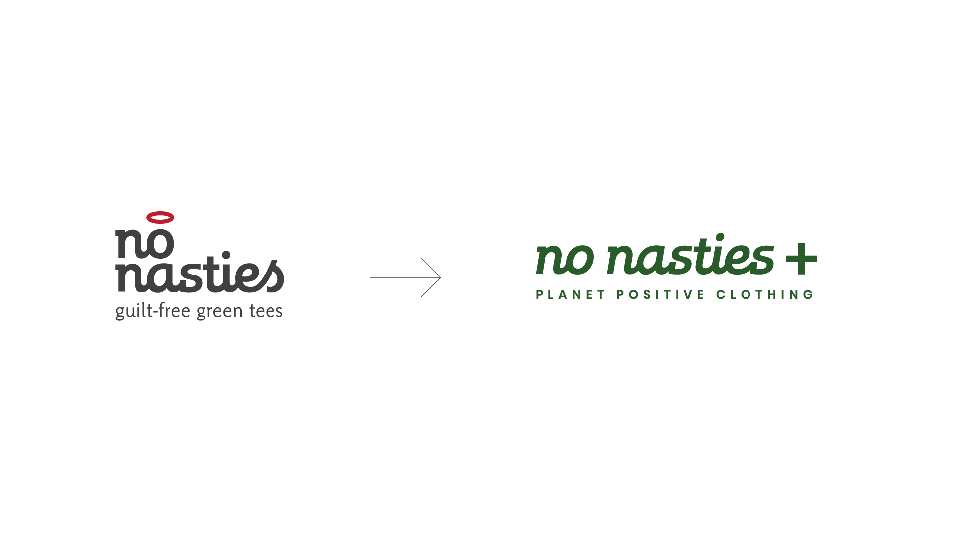
No Nasties
No Nasties is India’s leading 100% organic, fair trade & vegan clothing brand.
Brief
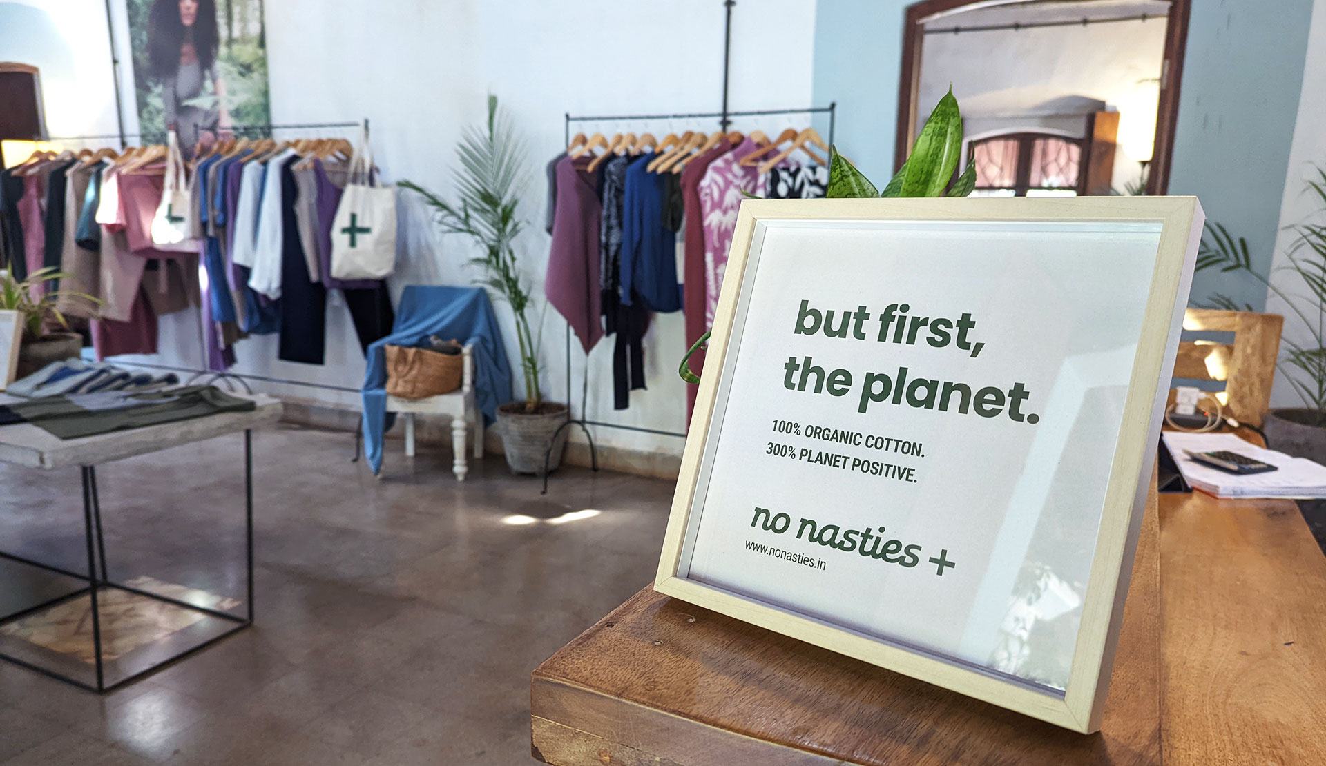
9 years since launching, No Nasties had evolved from a standard, ‘feel-good’ organic t-shirt brand into a fully fairtrade, organic, vegan & all-inclusive clothing label with a strong, bold & evolved expertise in sustainability. They required a change in identity & communication to reflect this. Since I had worked on the branding as a co-founder during its launch, I rejoined all those years later for the rebranding!
Execution
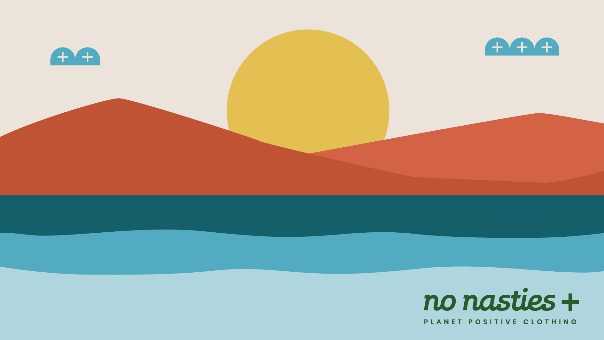
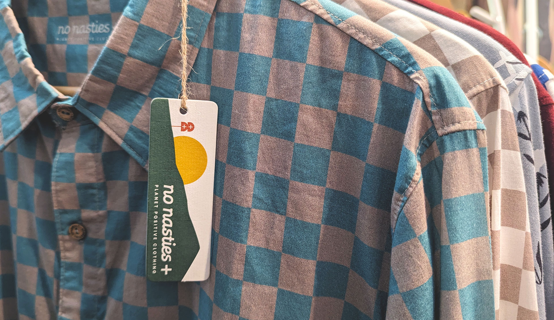
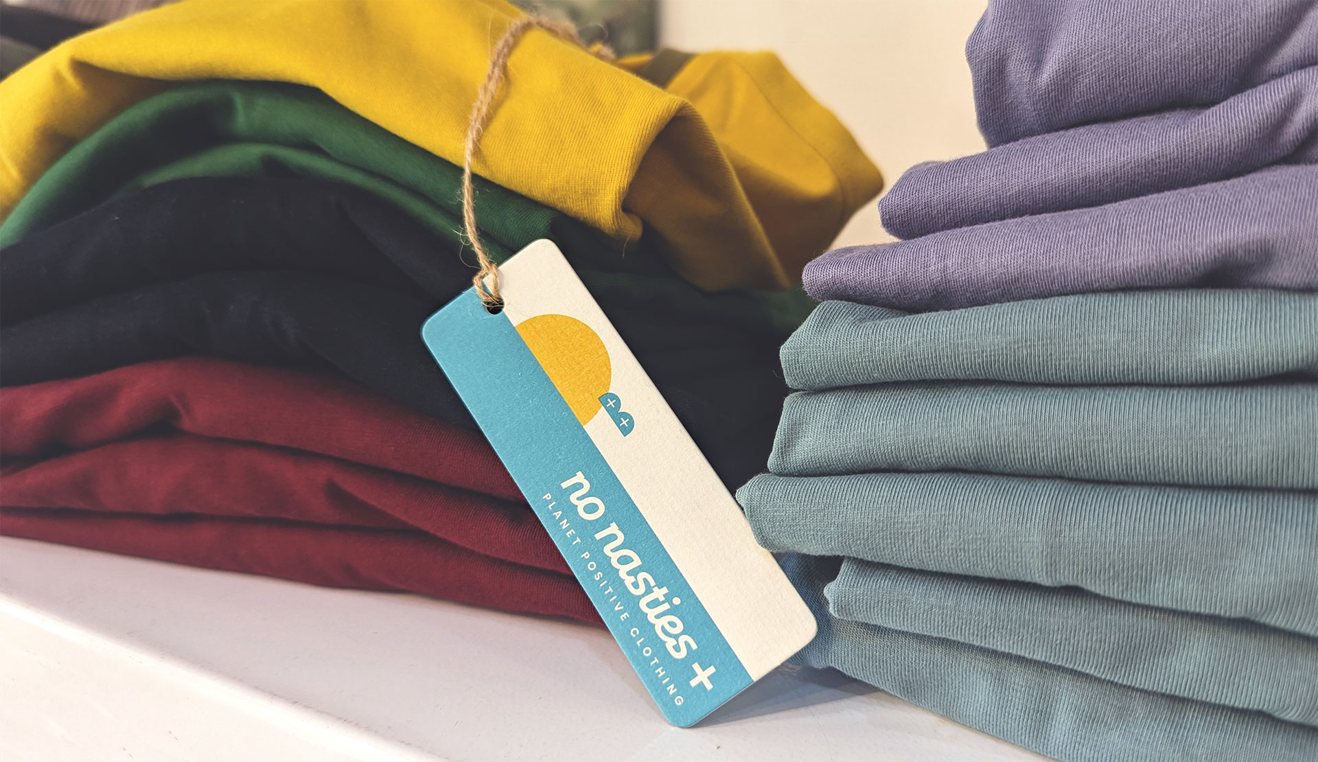
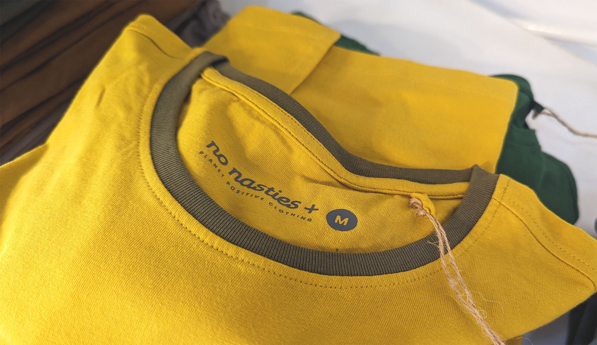
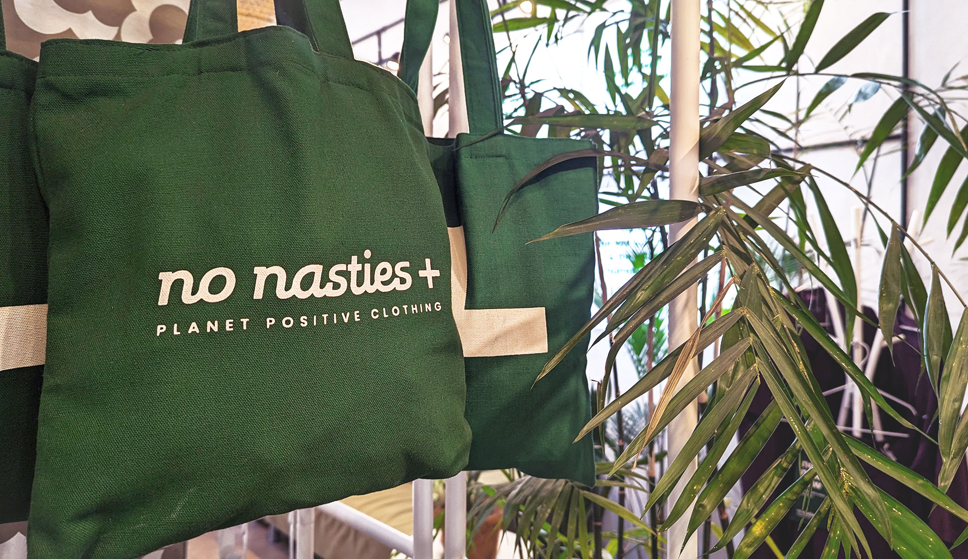
– Evolving from a sweet, feel-good ‘halo’ to a bold, assertive ‘plus’ sign that stands for positive climate action & impact
– Keeping the typeface the same (with some tweaks) to maintain recall
– The plus sign extends into illustrations of nature as ‘planet positive’ elements

Théla
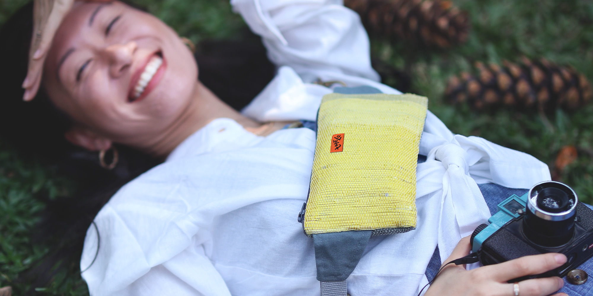
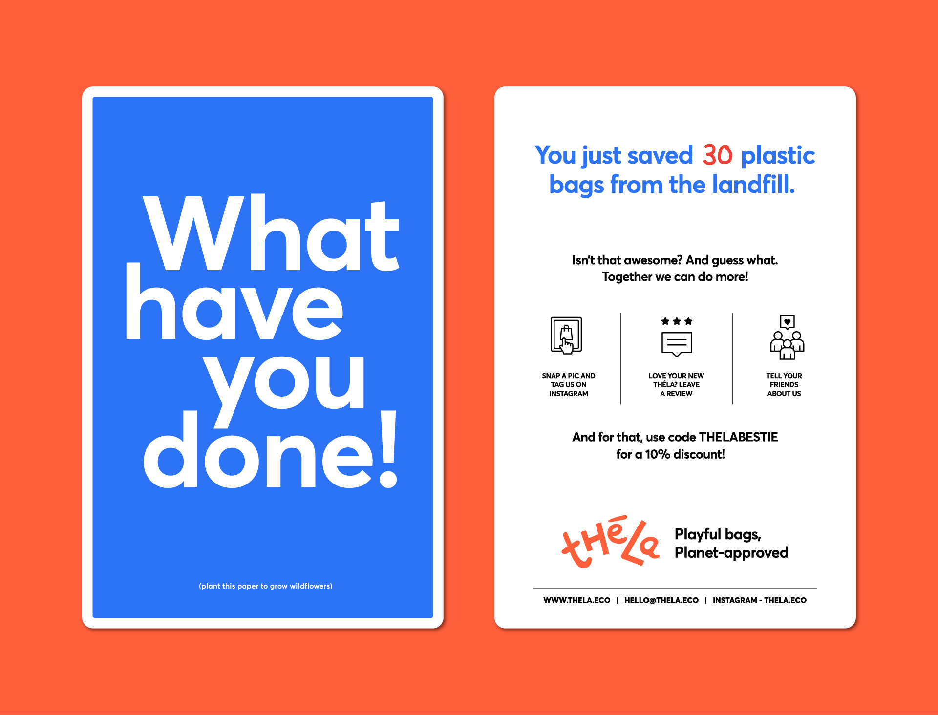
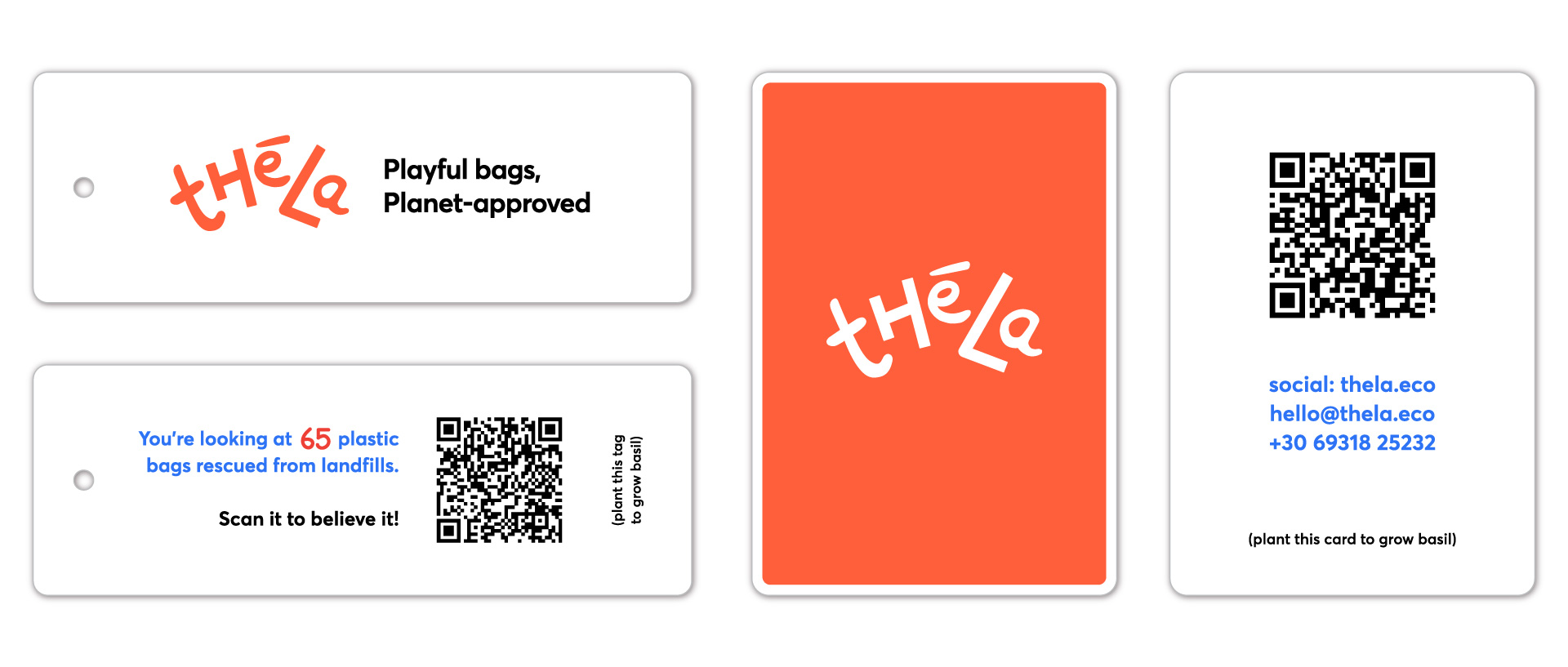
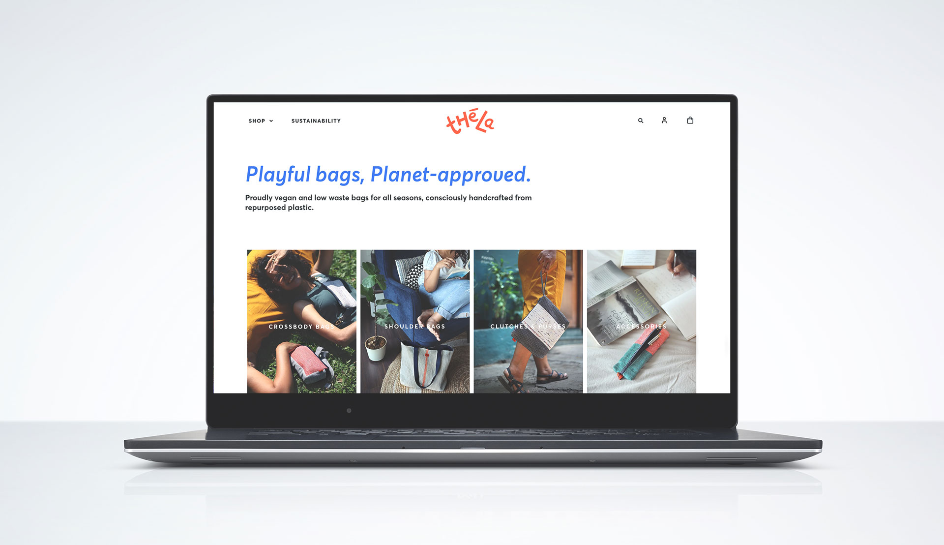
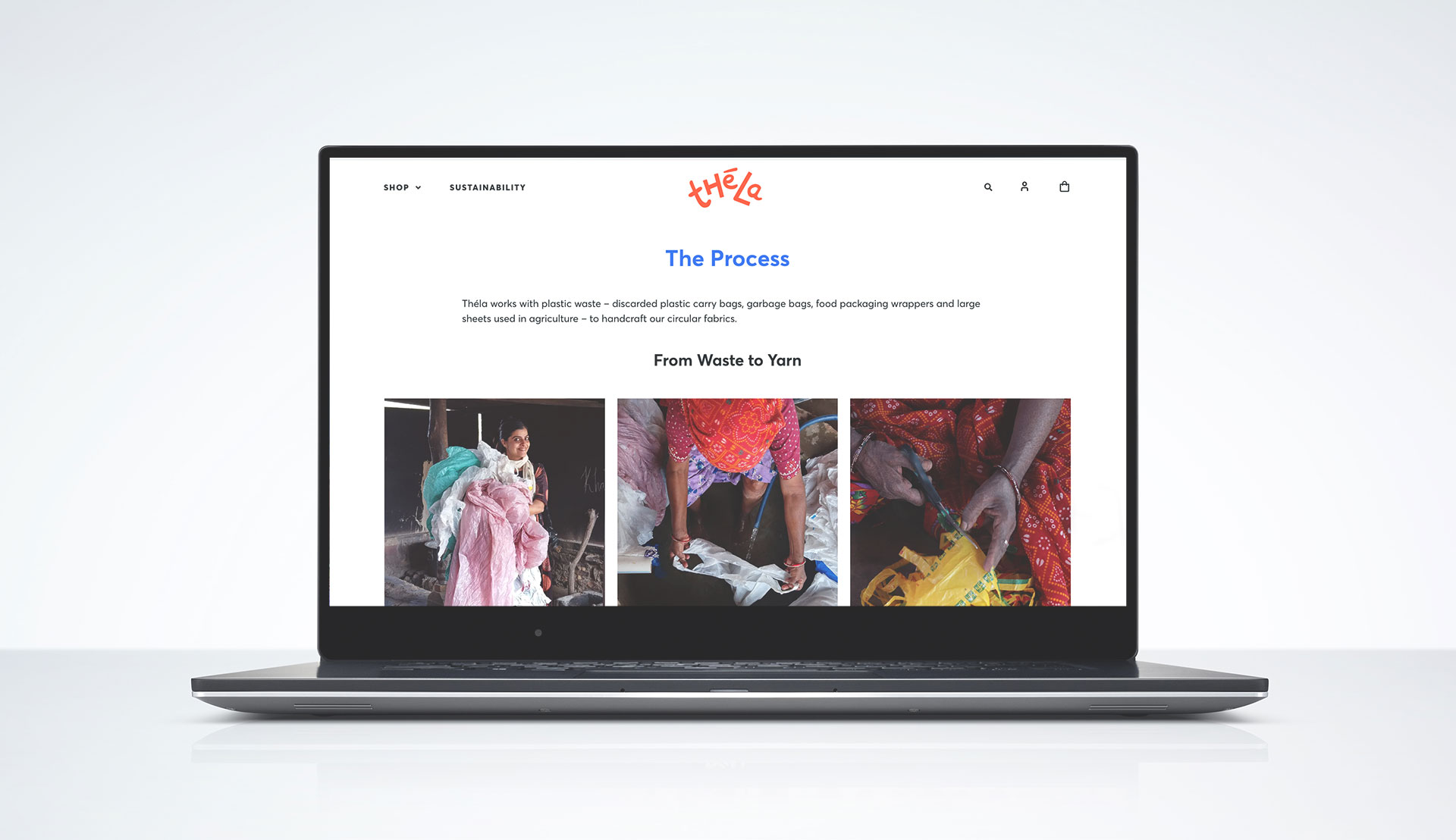
Théla is a sustainable fashion brand that works with artisans to handcraft bags & accessories from plastic waste like plastic bags, plastic sheets & food packaging wrappers.
Brief
To develop the brand’s voice and communication as a joyful, bold, sustainable fashion & lifestyle label.
Execution
Théla is a Hindi word meaning ‘bag’, colloquially used by super markets, corner shops and vegetable vendors for plastic carry bags. We aptly took this on as our brand name (as this is our main waste material).
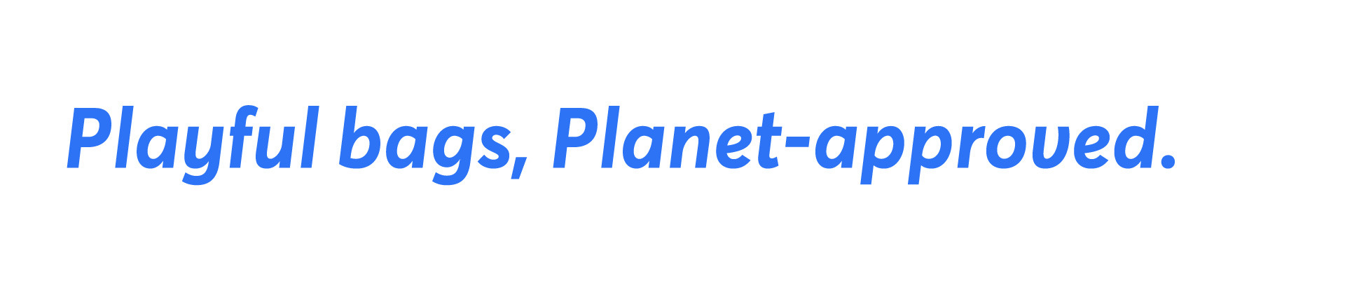
– A joyful, handcrafted font with a playful, coming-to-life arrangement of the alphabets
– Vibrant colours for joy, positivity and bold sustainability
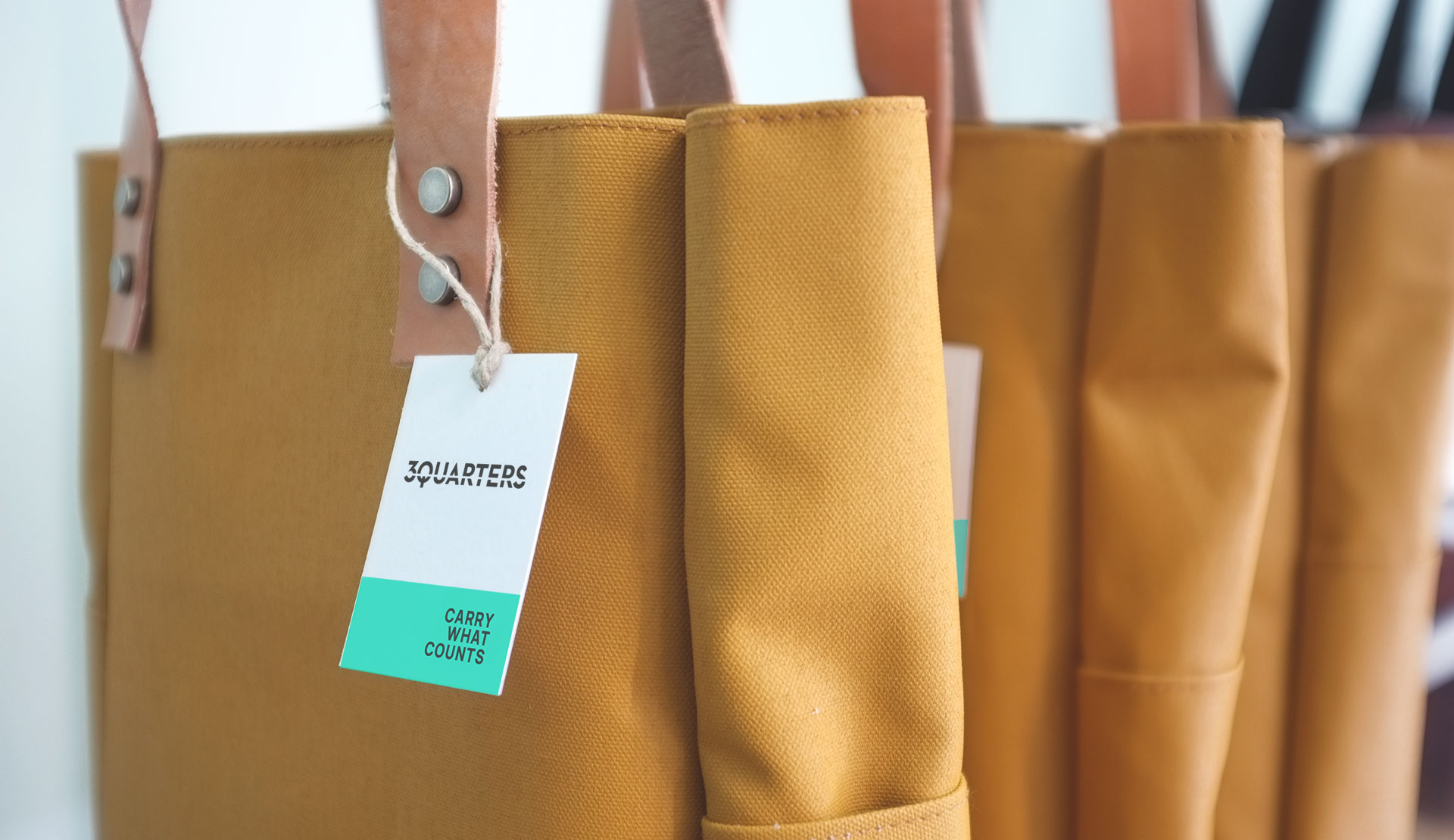
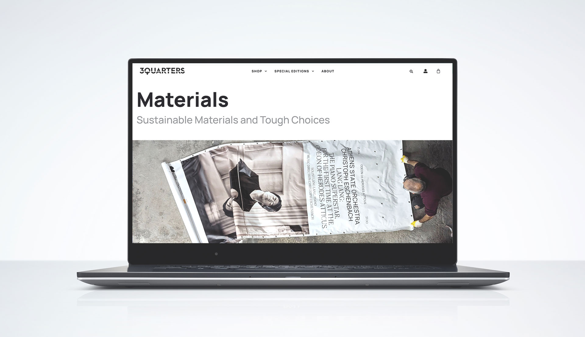
3QUARTERS
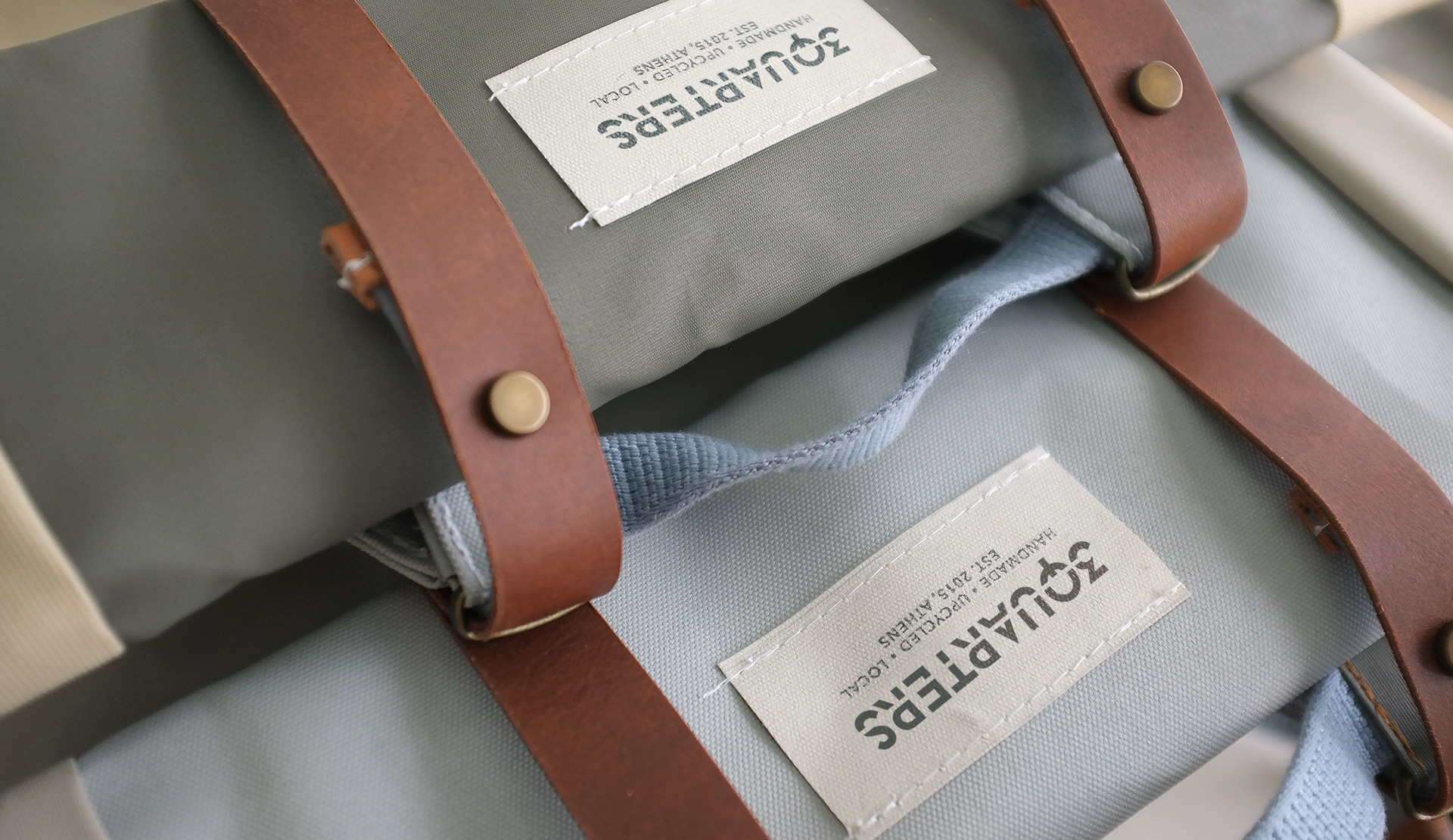
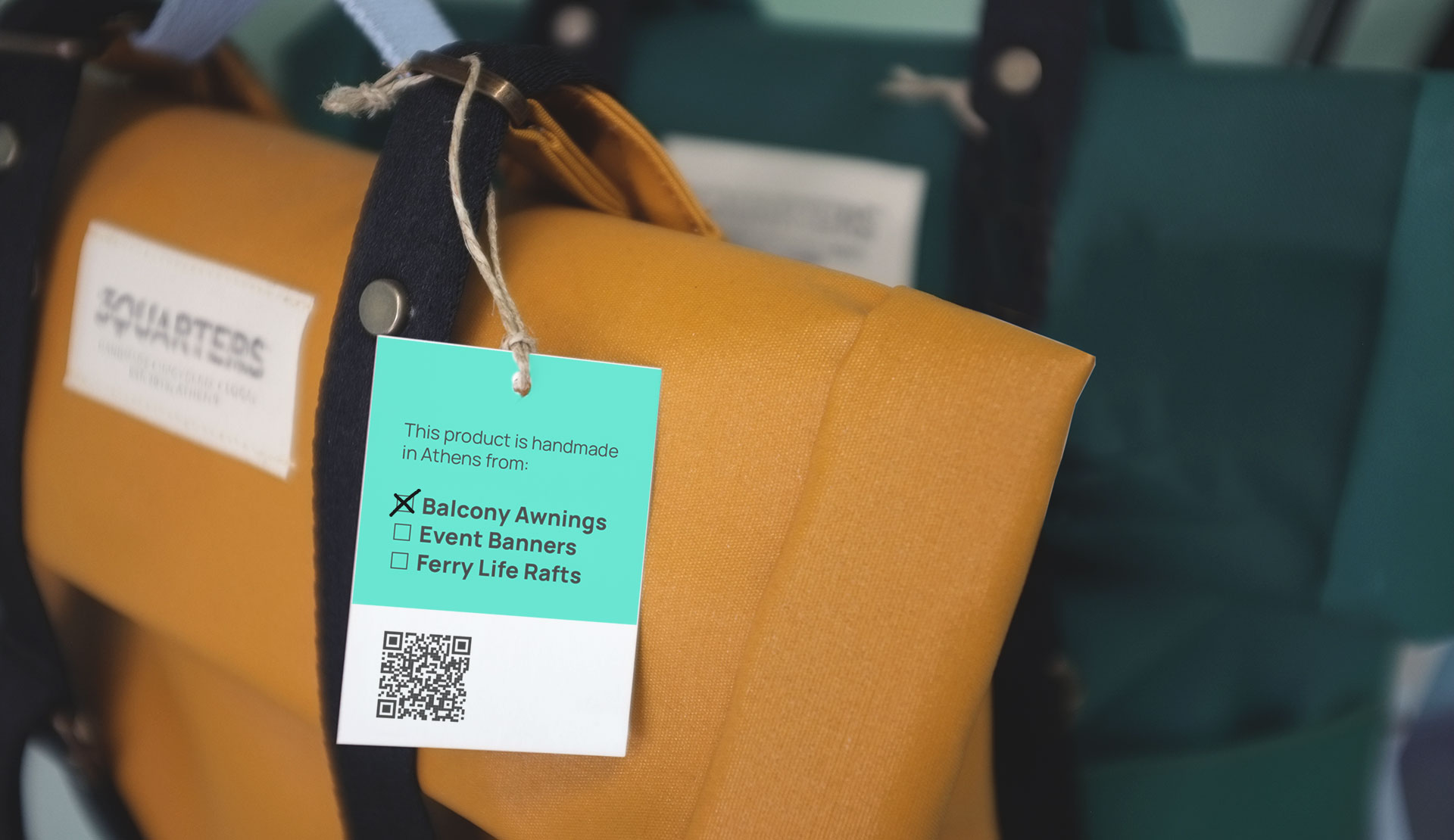
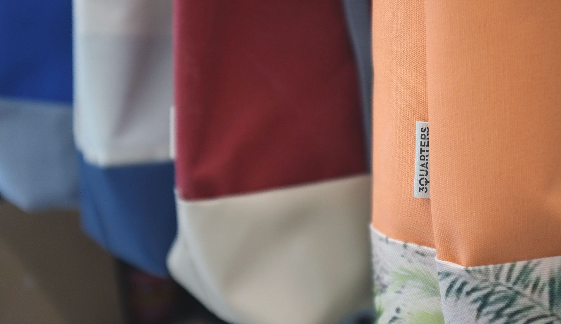
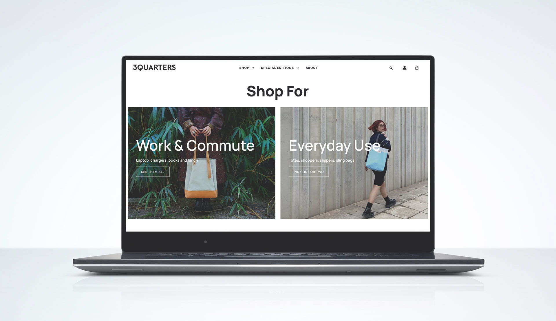
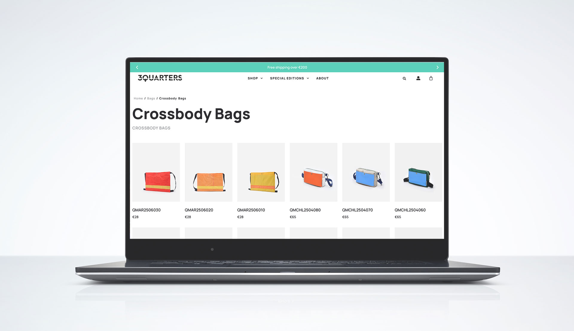
3QUARTERS is a slow, sustainable fashion brand in Athens that repurposes used & leftover large-scale textiles — balcony awnings, event banners & ferry life rafts — into reliable, utilitarian bags & accessories.
Brief
To develop the identity and communication of the brand, reflecting the values of bold sustainability, quality and craftsmanship.
Execution
– Minimal, bold typeface sliced at a distance of 3/4th
– Big, bold headings and a strong turquoise brand colour
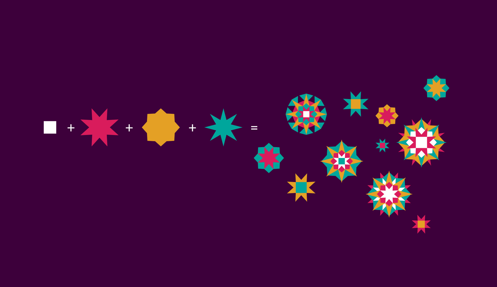
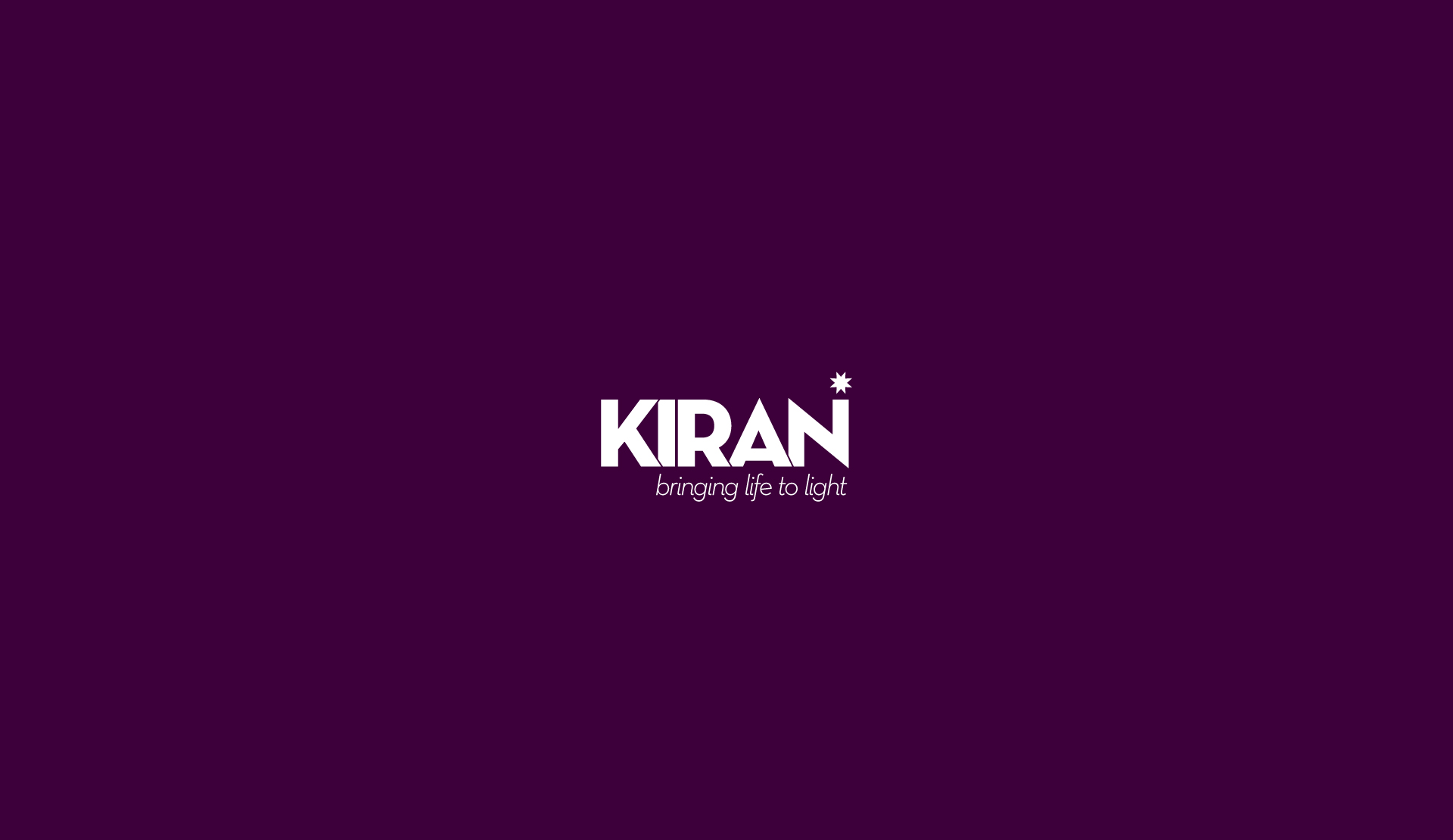
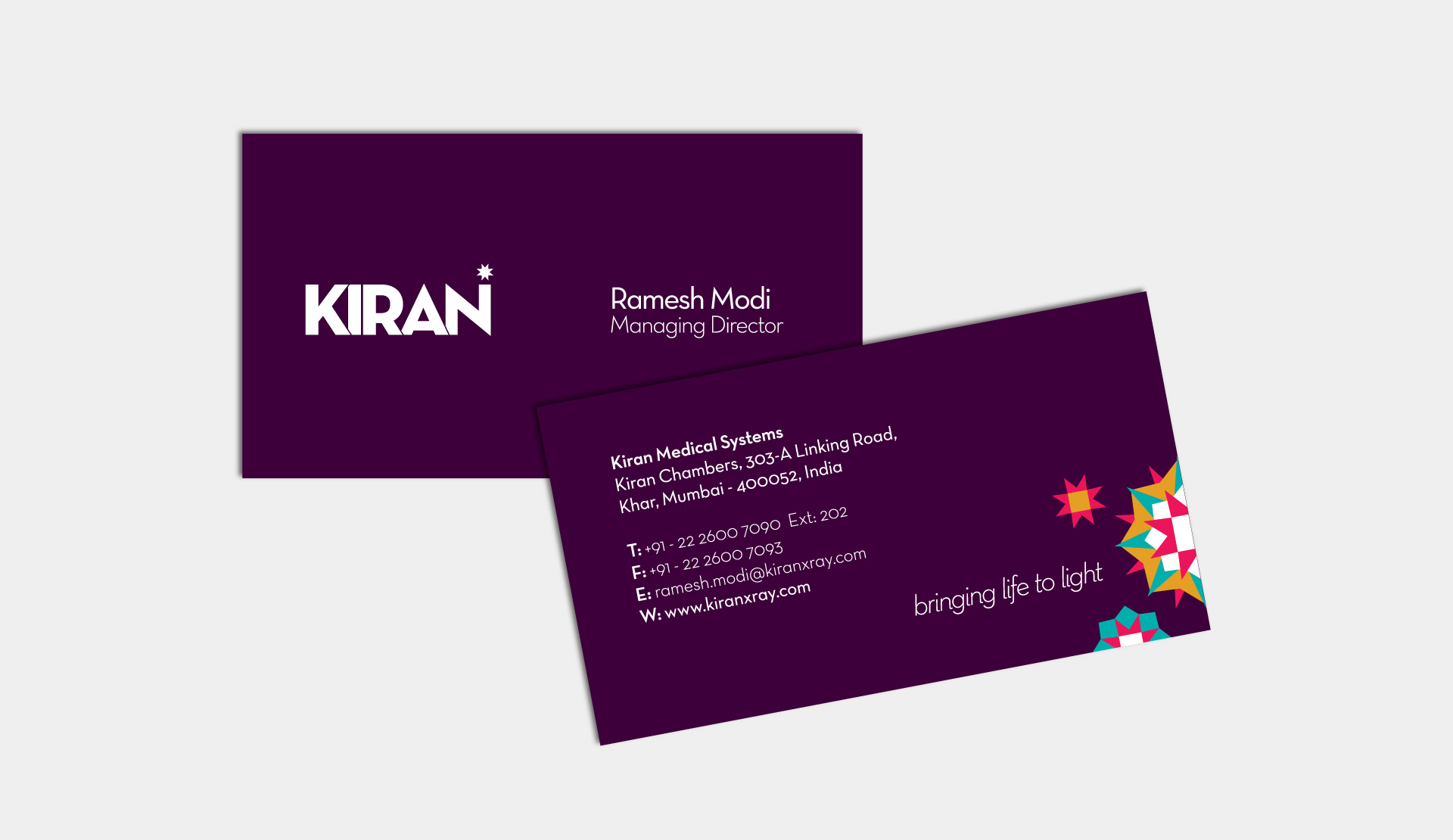
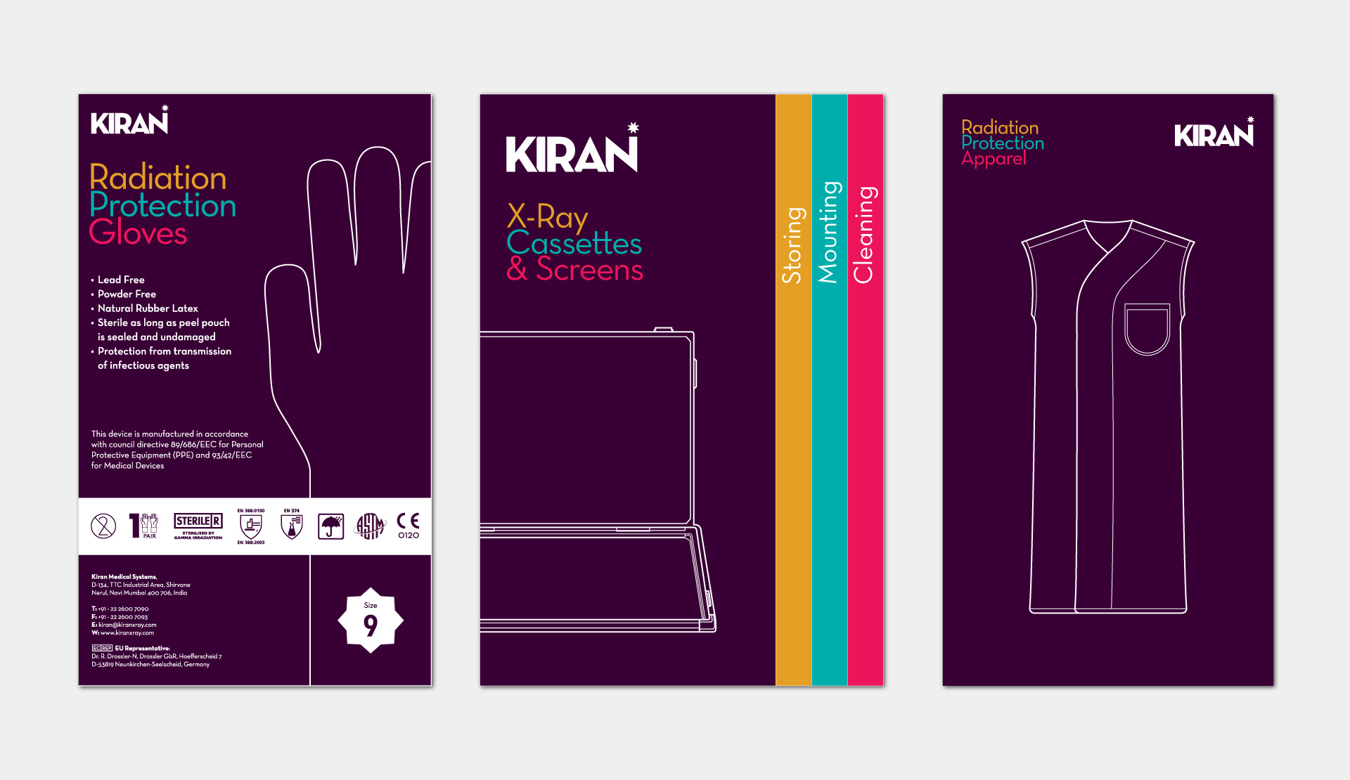
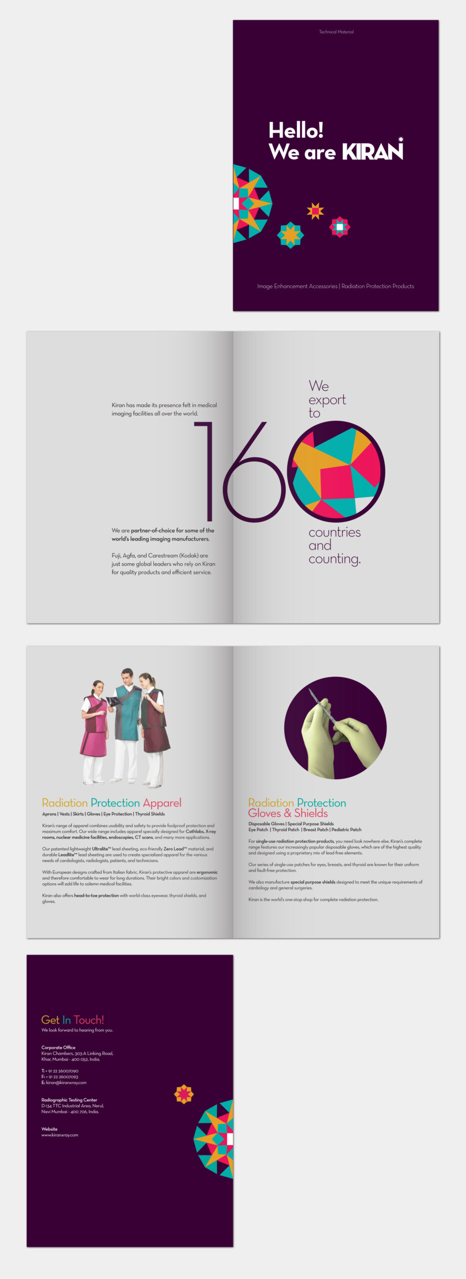
Kiran
Kiran is the world’s leading manufacturer of medical imaging accessories and radiation protection gear and is a partner-of-choice for imaging product manufactures like Fuji, Agfa and Kodak.
Brief
Being an ‘Indian’ company, Kiran was not able to establish their name in the global sector in spite of their superior quality and hence sold their products through more established global players. In order to succeed in the global market independently, they required an identity and print design communication that is unique enough to stand apart from the rest of the global competition.
Execution
We started with a main design element – the Kaleidoscope. We wanted to break the traditional medical company mould and showcase the warmth inherent to the brand. The shapes, patterns, colours & ‘play of light’ of the kaleidoscope give a positive & humane touch to the brand.
– A tagline that captures Kiran’s global & widespread contribution without being scientific, and that also compliments the tagline
– A visually strong, simple & powerful typeface for the logo, complemented by a star to reflect the confidence, positivity & warmth of the brand
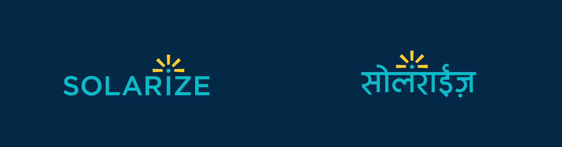
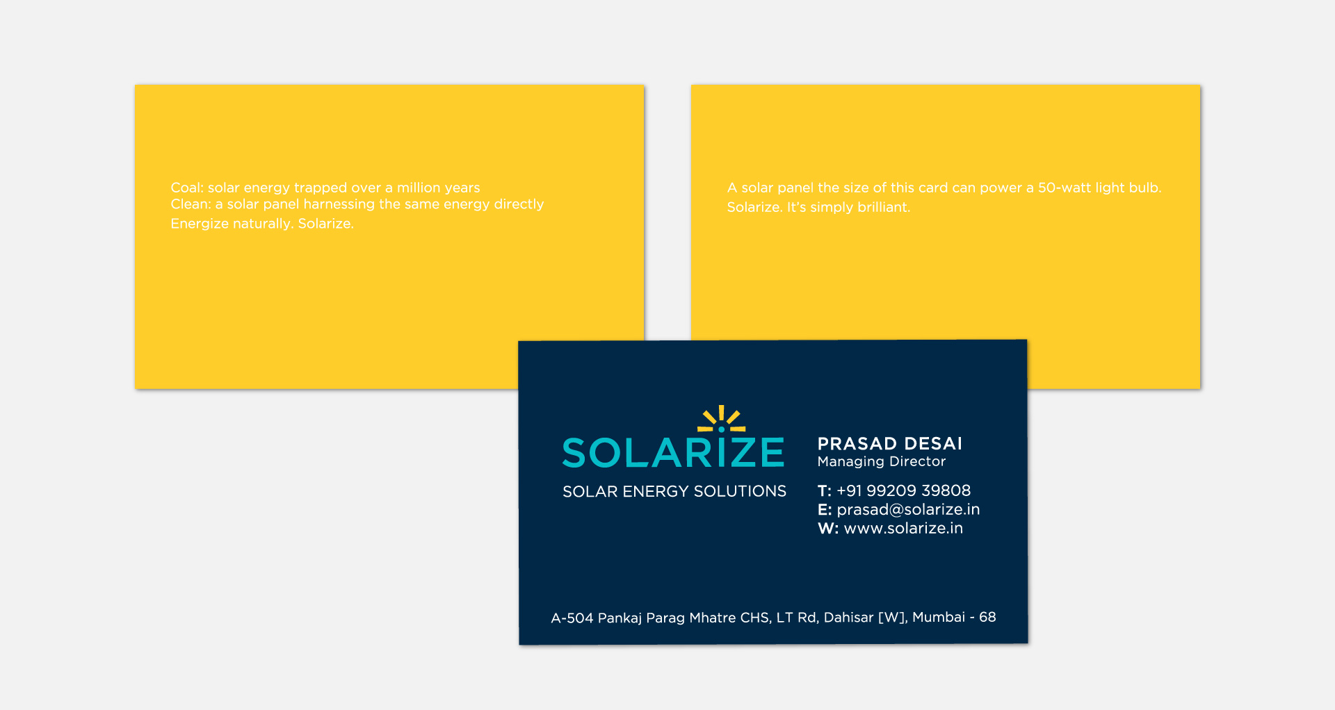
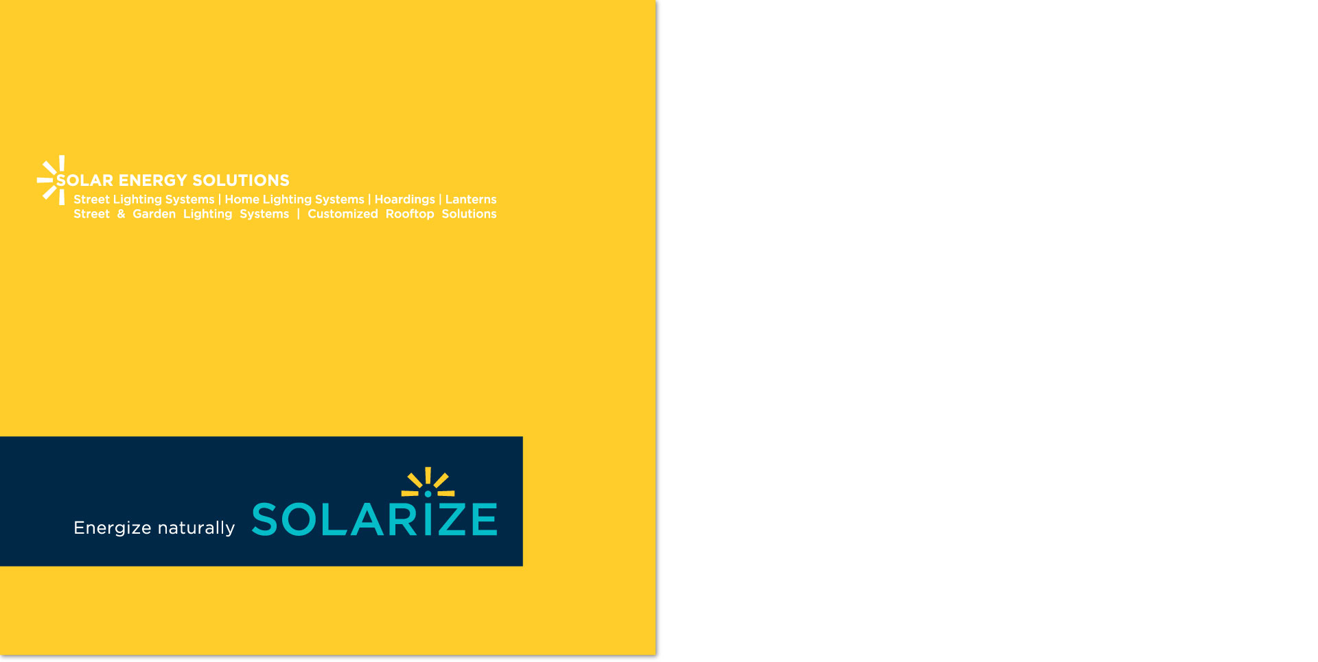
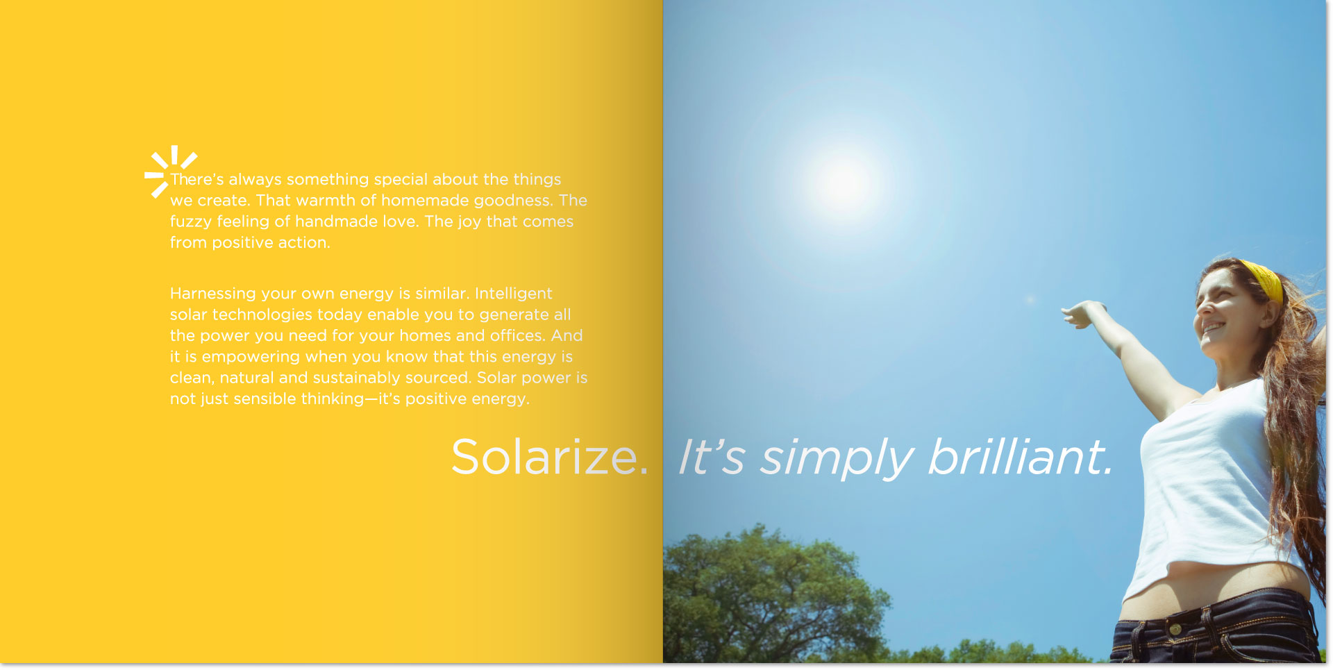
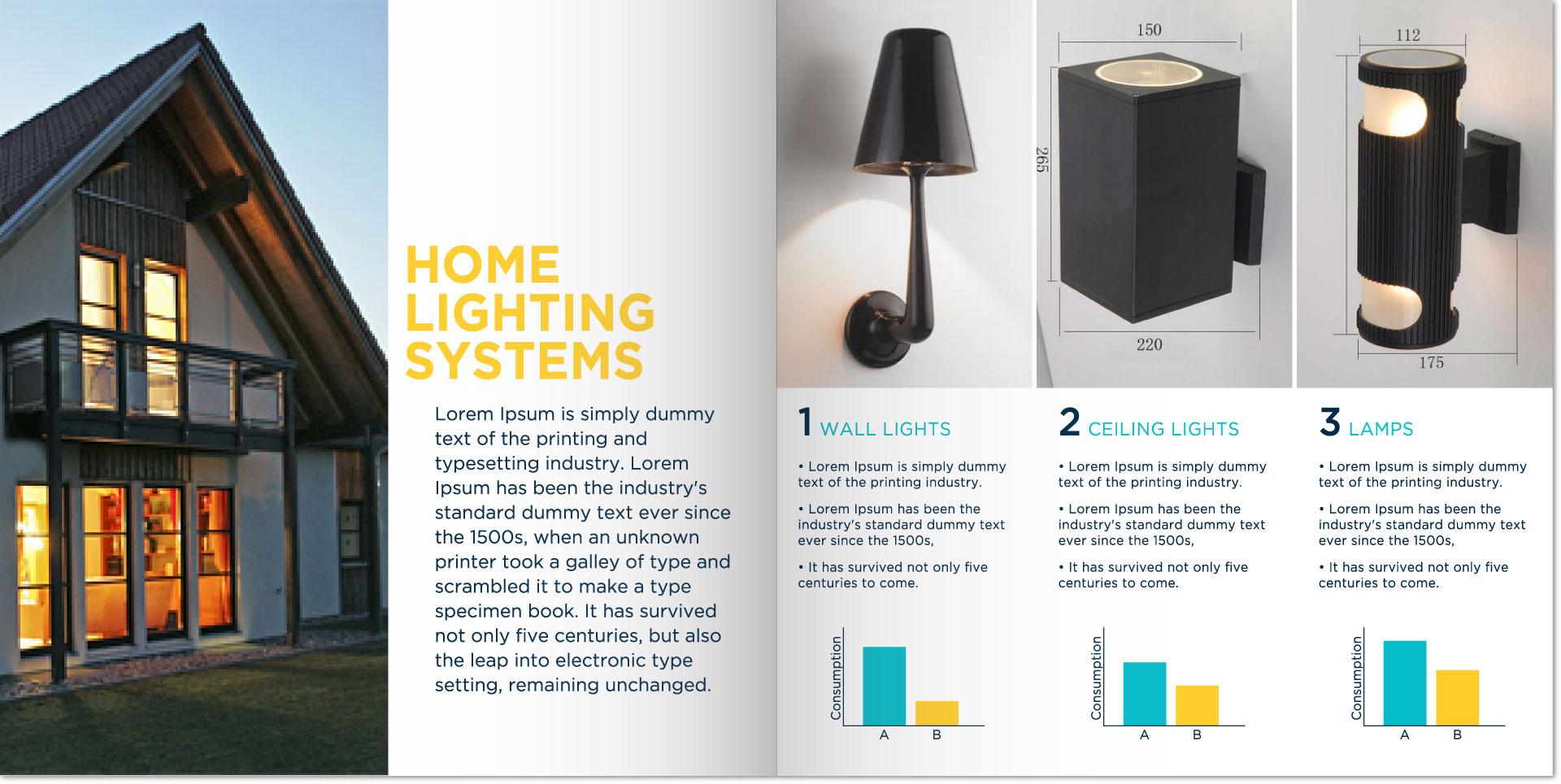
Solarize
Brief
Naming, identity & design strategy for a young solar solutions provider to position them in India & across the globe as an up-to-date, inspiring & sensible solution to traditional power sources.
Execution
We wanted the company to project how solar energy can transform people’s lives and to embrace it as a lifestyle choice.
– Name: Short, snappy, young & motivates action.
– Design element: A torchlight that hints at the sun and is suggestive of the logo being ‘solarized’/solar-powered
– Font: A simple font to highlight the design element
– Colour palette: Youthful & bright — reflective of the solar sector
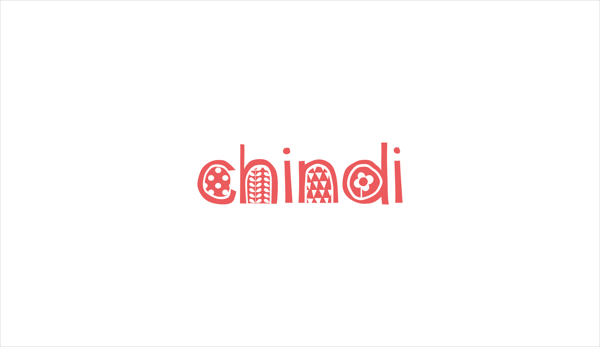
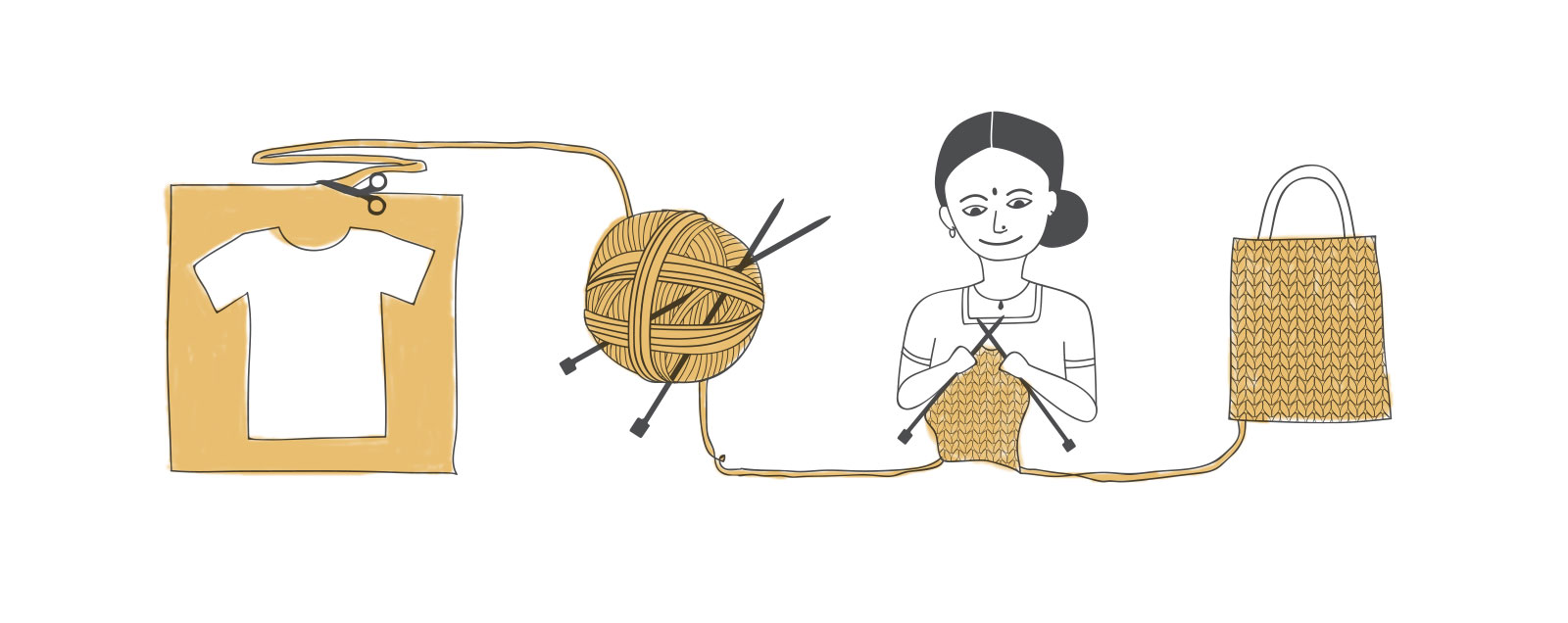
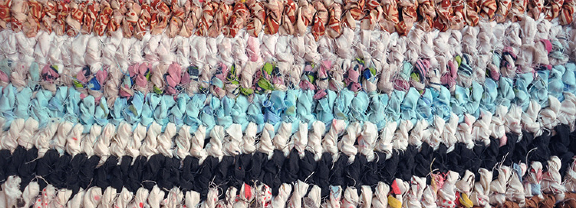
Chindi
Chindi was a fashion & homeware brand that worked with women from marginalized communities in India to handcraft products from post-consumer textile waste.
Brief
To design an identity, stationery & infographic that reflects the brand’s ethnic & handcrafted attributes.
Execution
‘Chindi’ is a Hindi word meaning ‘miserly’ or ‘stingy’ and is used colloquially by Indian tailors & textile factories for scrap fabric left over after production. We took a positive spin on the word to mean ‘frugal’ or ‘mindful’ — an essential quality to embrace sustainability.
– The font is handcrafted to reflect the company’s handmade essence
– The alphabets are filled with design elements that represent Indian textile prints

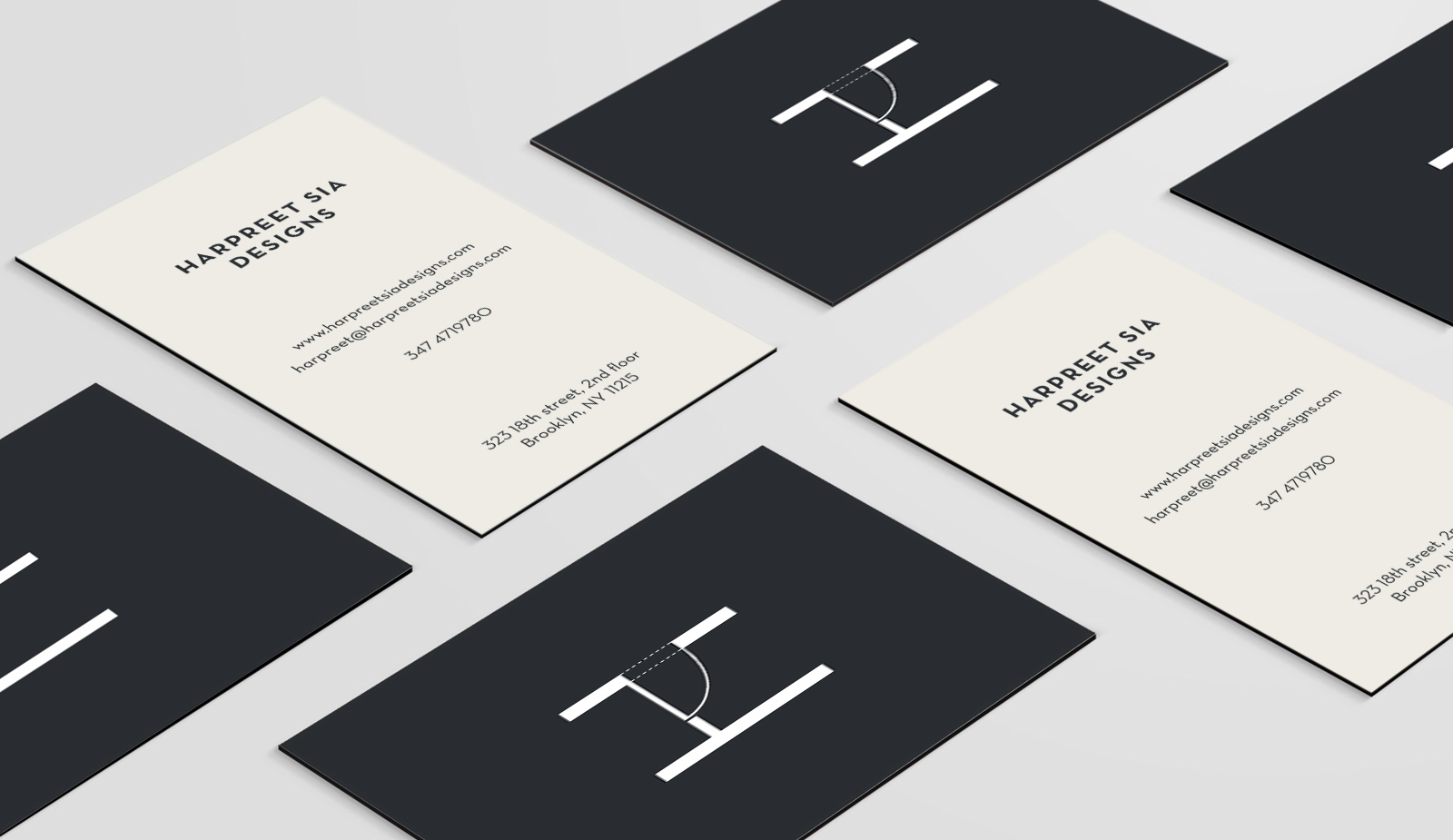
Harpreet Sia Designs
Brief
Identity creation for a New York based architect, Harpreet Sia.
Execution
– Design element: An architectural representation of an open door (for openness & honesty) set in her name initial
– Colour Palette: Simple, black & white (for transparency in communication)
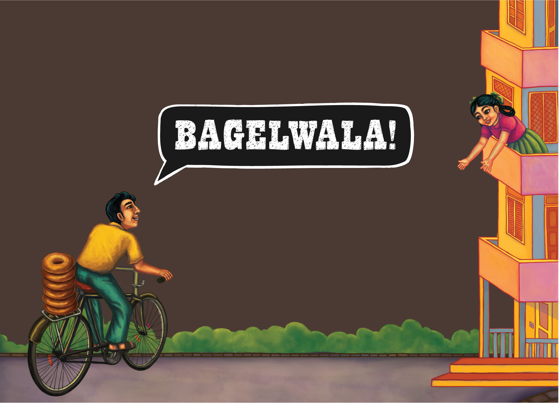
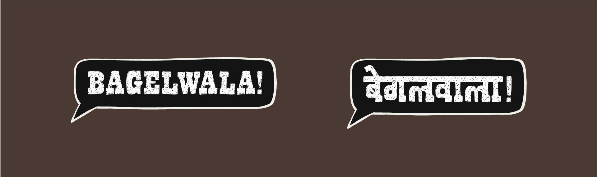
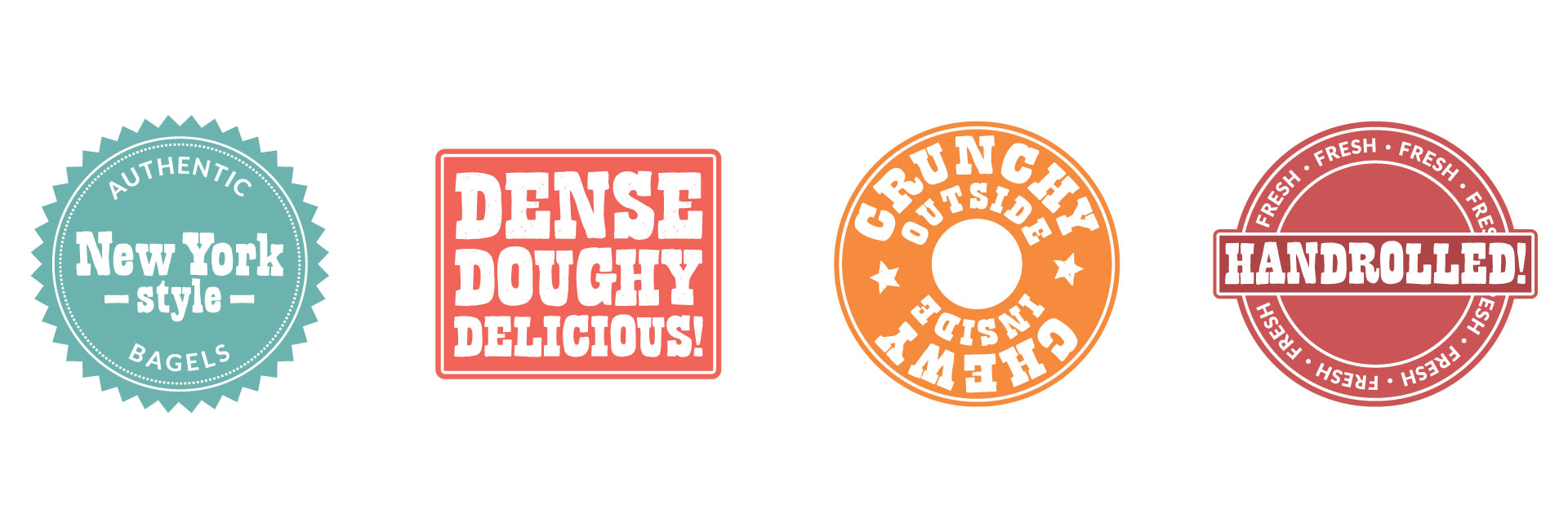
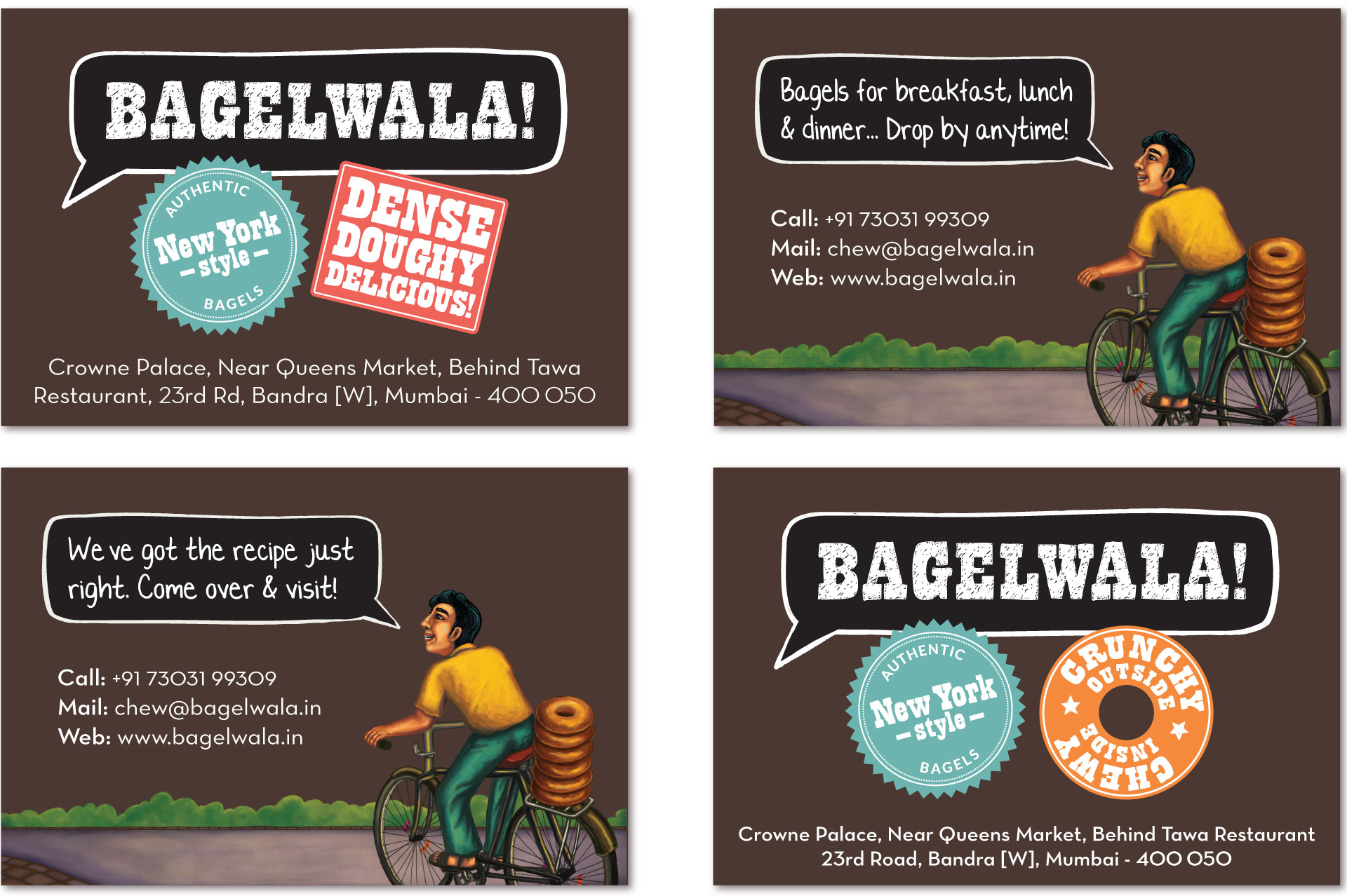
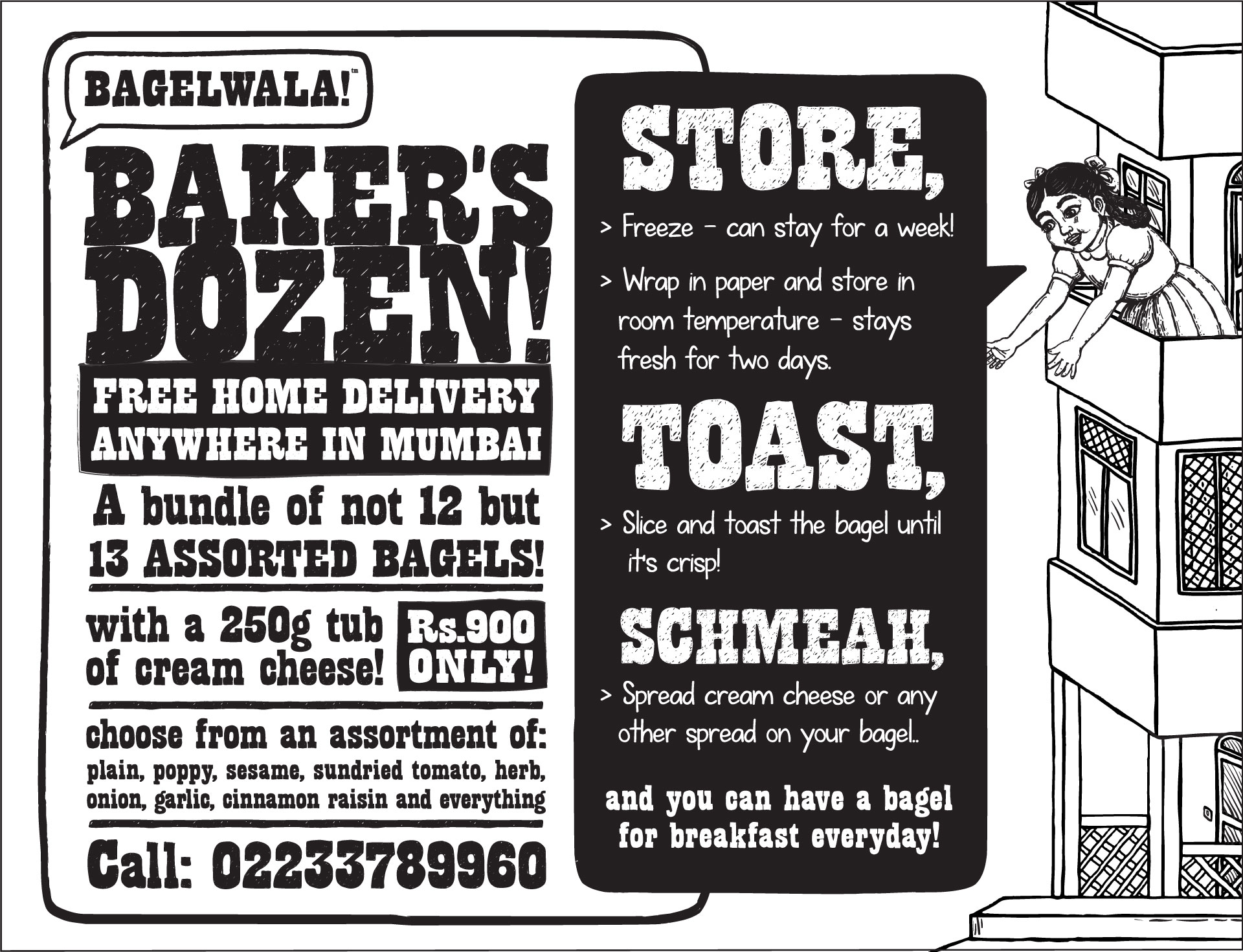
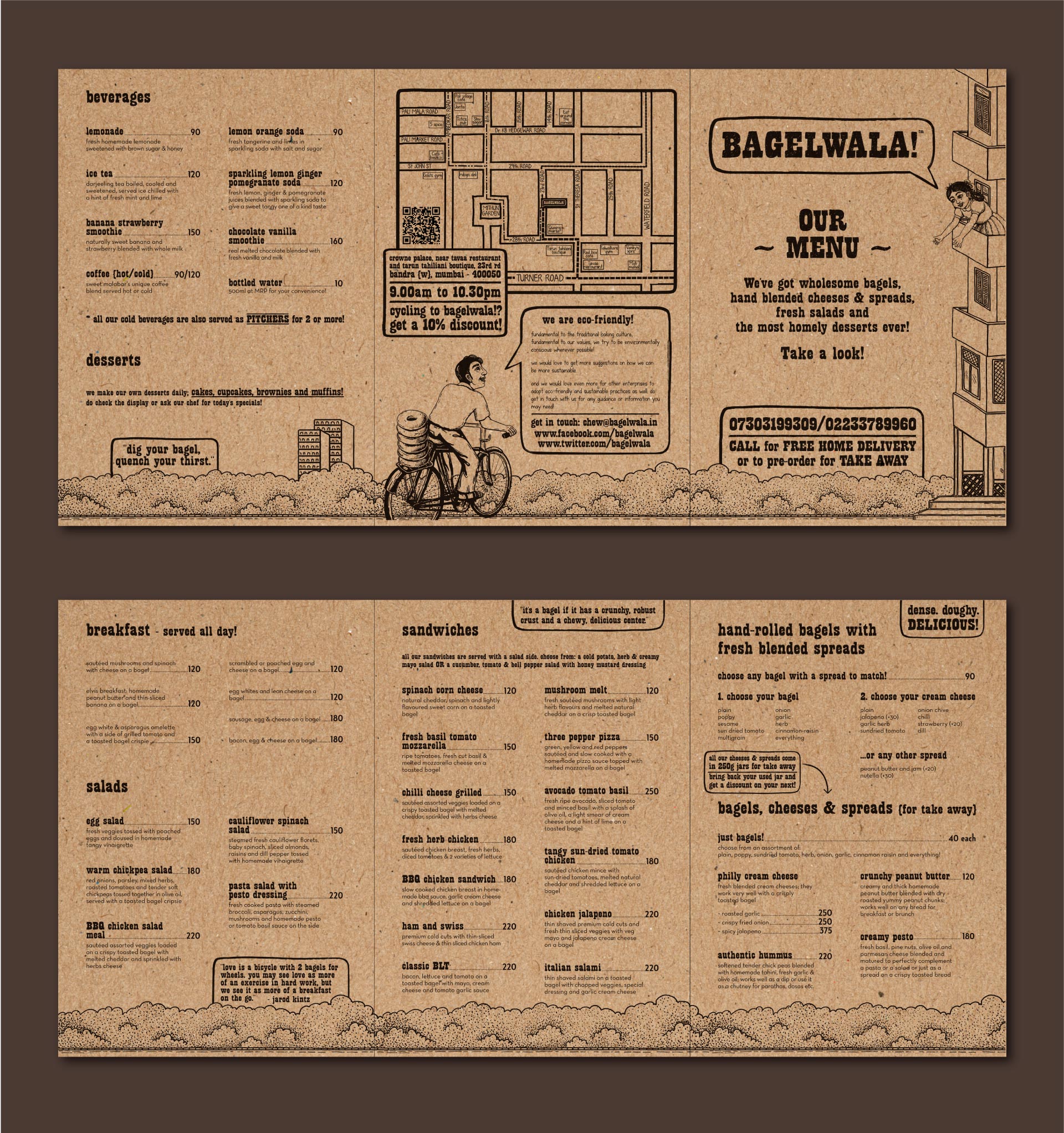
Bagelwala!
Bagelwala! was a casual, friendly sit-in cafe & diner in Mumbai that specialized in fresh, hand-rolled, ‘authentic New York style’ bagels.
Brief
Being a relatively new product in India, the name, identity & communication needed to reflect the values of traditional Jewish baking and the local importance of bagels in New York in a way that is relatable to the Indian consumer.
Execution
‘Wala’ is a Hindi suffix added to all types of vendors — paperwala (newspaperman), doodhwala (milkman), etc. We wanted the café to have the same shop-around-the-corner vibe. So we called it Bagelwala!
– Hand written, chalk on slate style — just like you see in a bakery
– Speech bubble for our friendly neighbourhood chatty vendor!
– Classic, well-known illustration style inspired from Indian textbooks
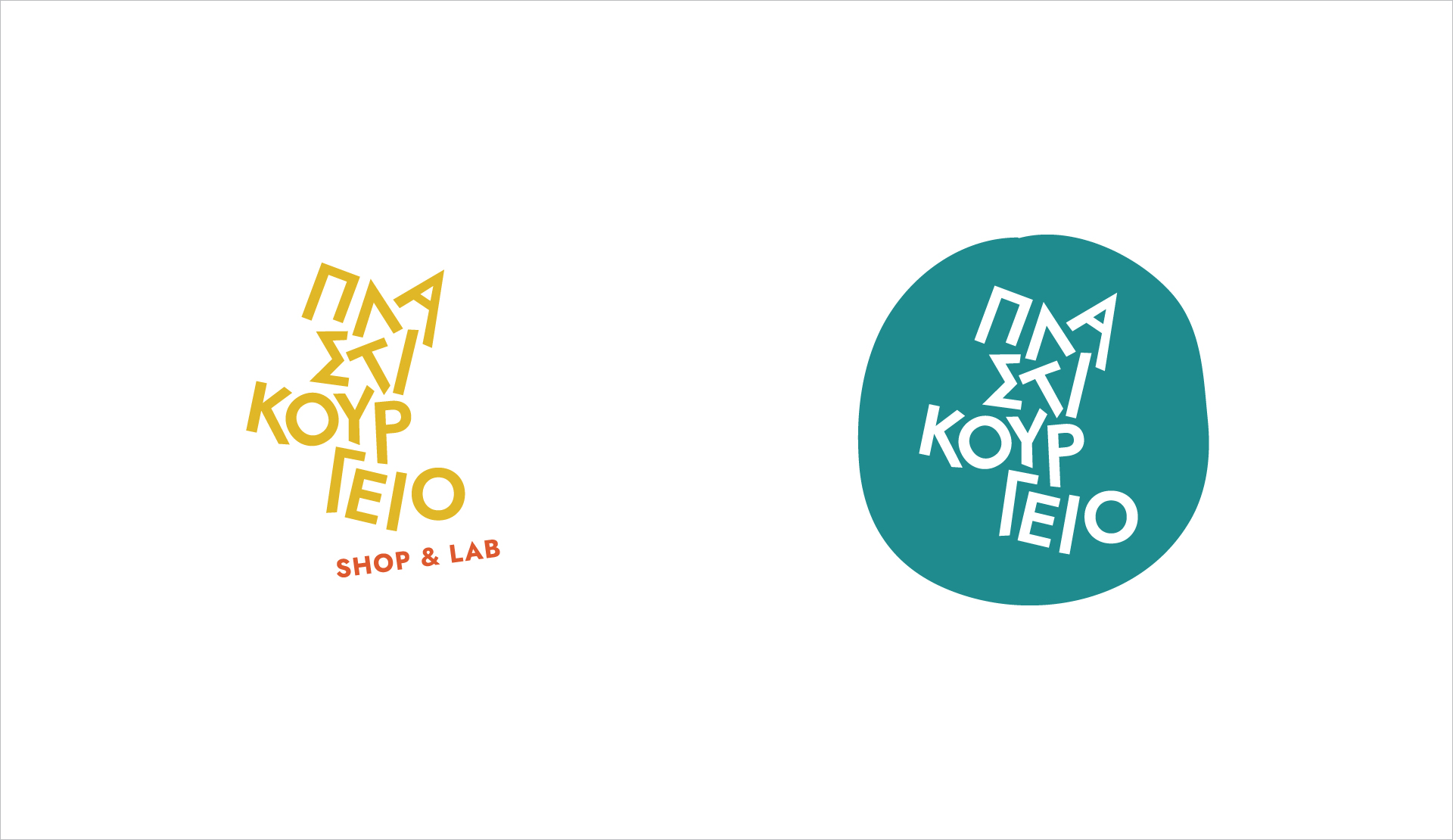
Plastikourgeio
Plastikourgeio was a recycling & creative reuse lab as well as the first zero waste shop in Athens.
Brief
To redesign their logo to highlight
– the playful, experimental nature of the lab
– the wide variety of zero waste, reusable & plastic-free products at the shop
– that sustainable living can be a fun, creative journey
Execution
Tweaking a simple typeface & adding vibrant colours to bring in the values of positivity, creativity, variety & experimentation.